Twenty Two
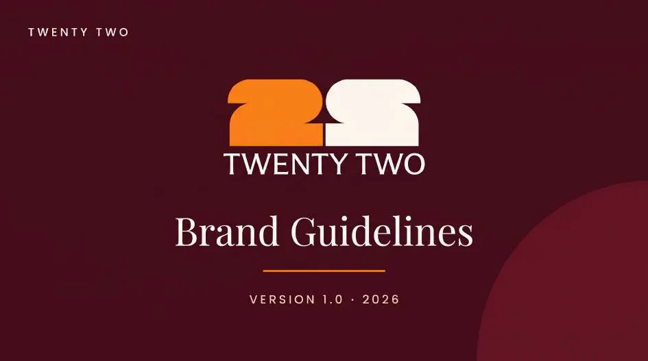
Two shapes. One identity. A bold “22” monogram in orange and maroon for a burger-and-pizza brand, built into a full guideline book, a packaging range and a launch feed.
- Client
- Twenty Two
- Sector
- Fast food
- Scope
- Strategy, identity, packaging, social
- Deliverables
- 12-page guidelines, packaging range
The idea.
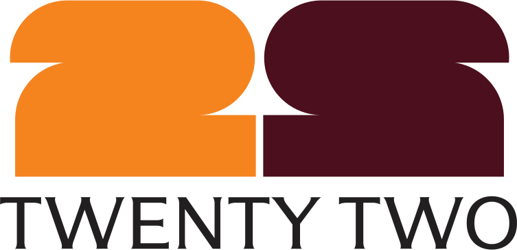
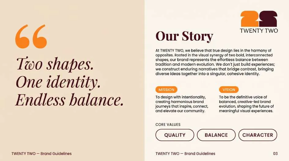
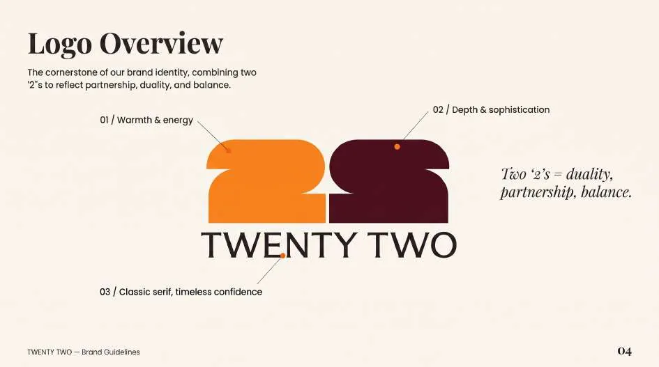
Twenty Two serves two cravings under one roof. The identity turns that into a mark: two interlocking 2s, one in warm orange and one in deep maroon, standing for duality, partnership and balance.
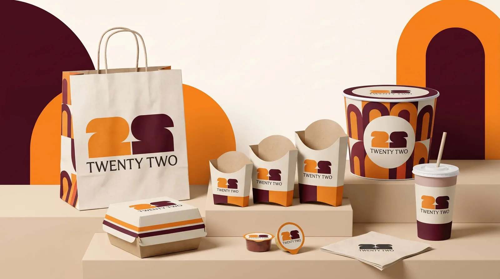
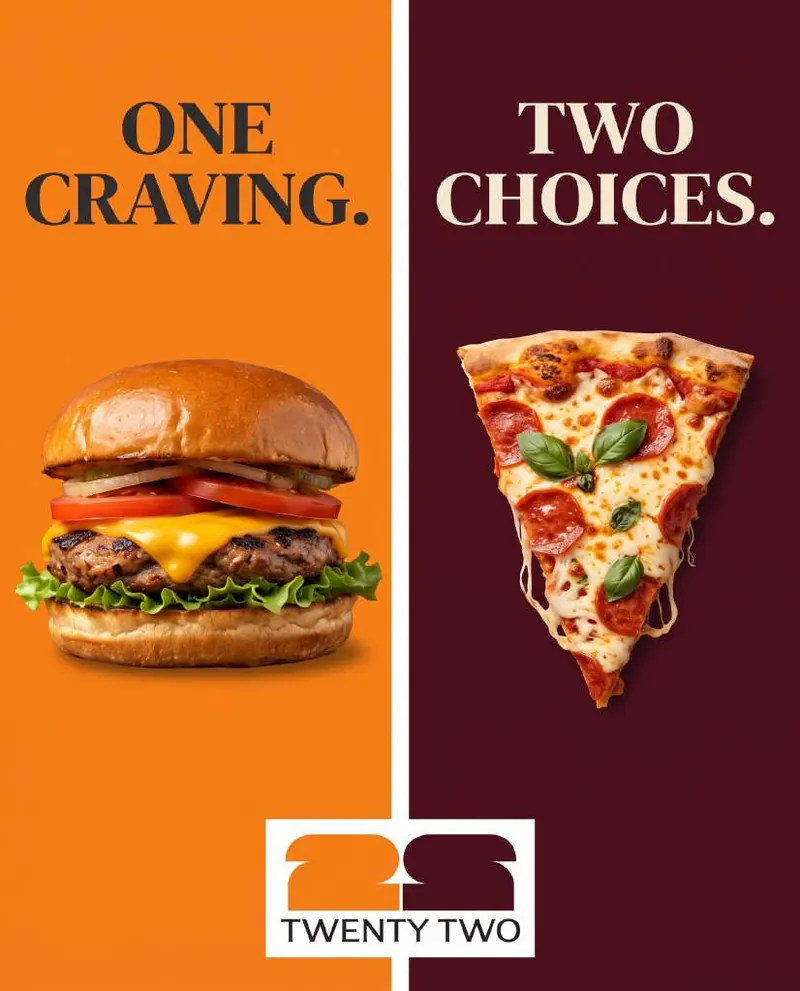
The positioning (“One craving. Two choices.”) runs through everything, from the guideline book's core values of Quality, Balance and Character to a packaging range that alternates the two colours piece by piece.
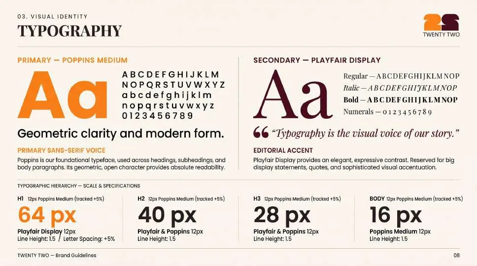
Poppins primary · Playfair Display secondary
- 124posts
- 12.4Kfollowers
- 153following
 Burgers
 Pizza
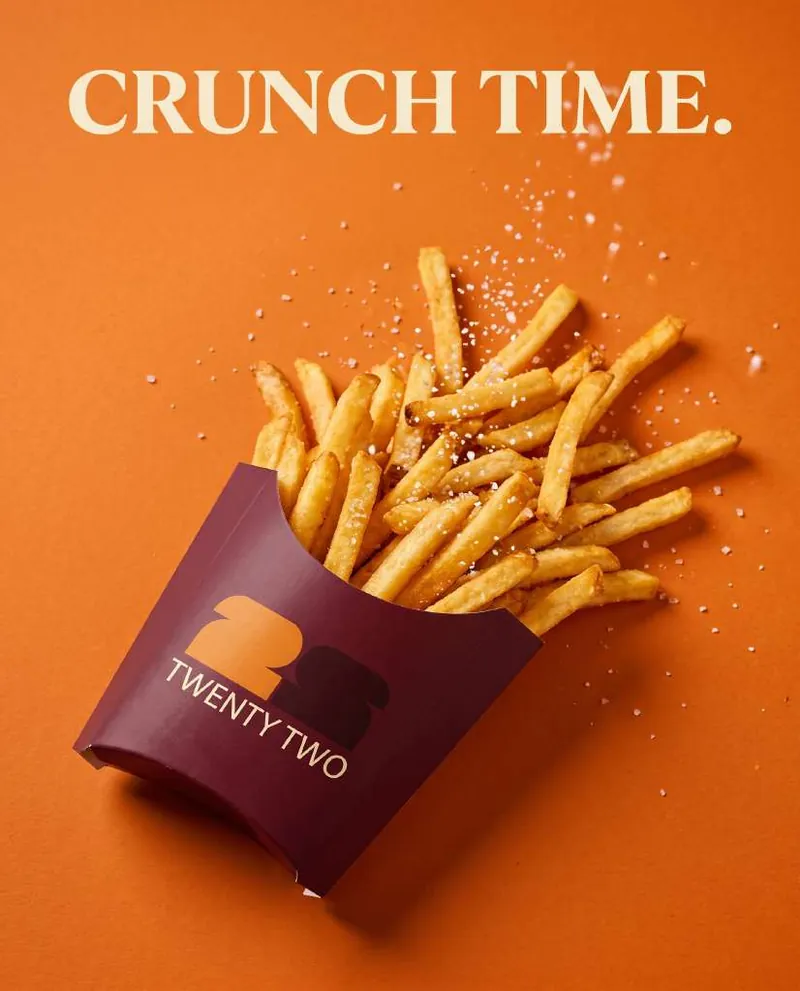 Sides
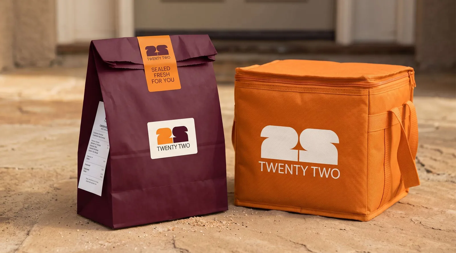 Delivery
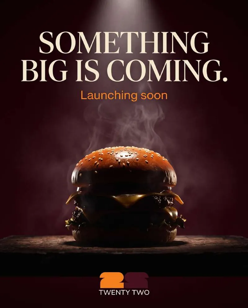 Launch
Two shapes. One identity. Endless balance.
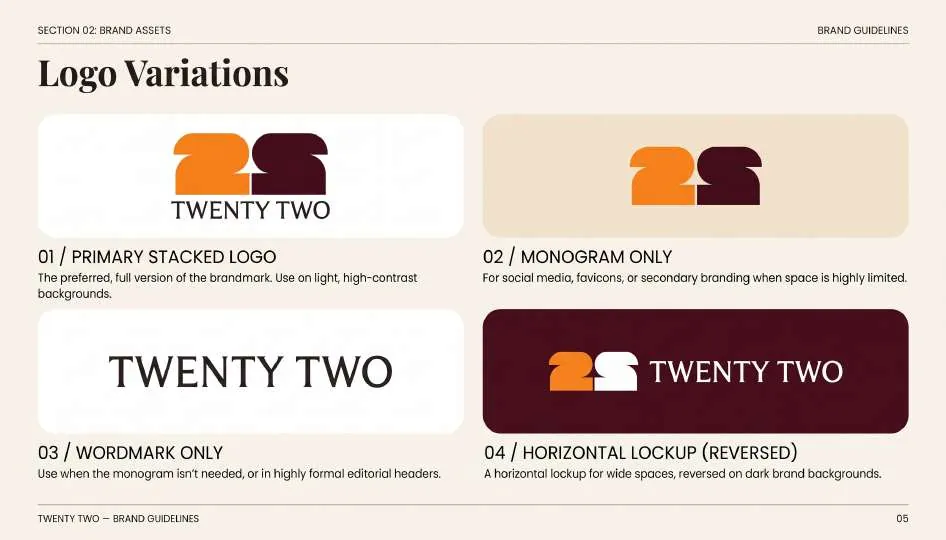
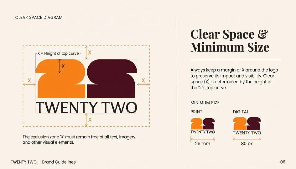
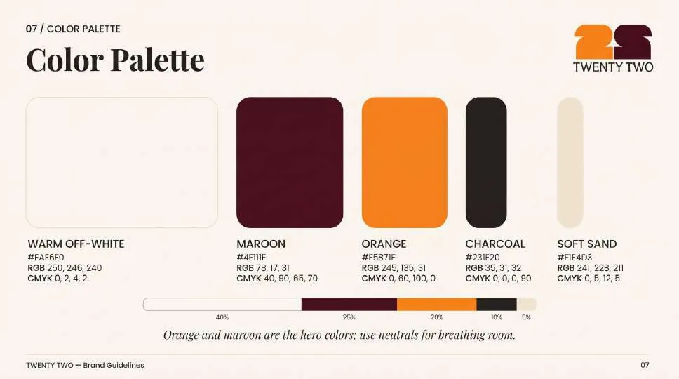
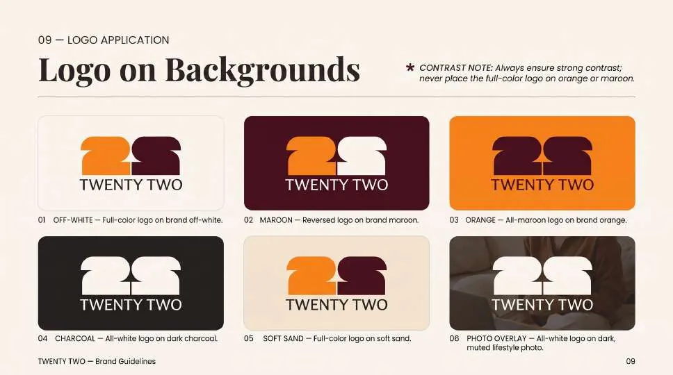
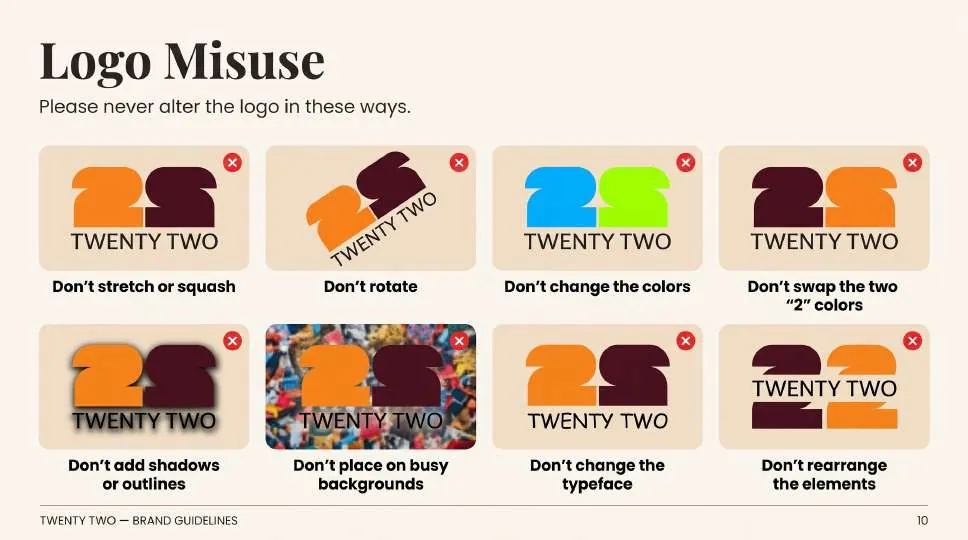
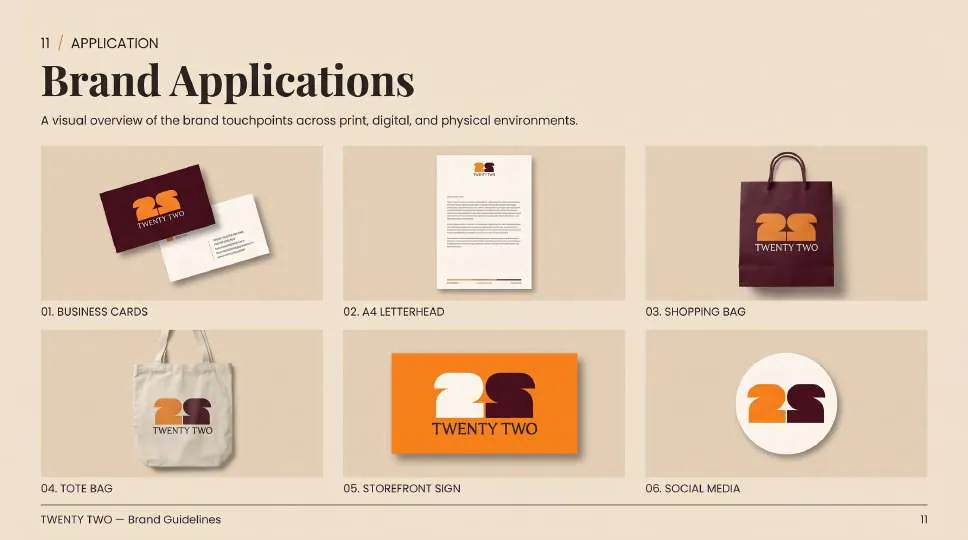
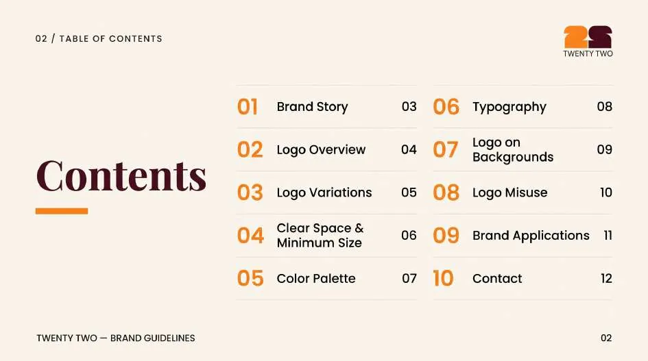
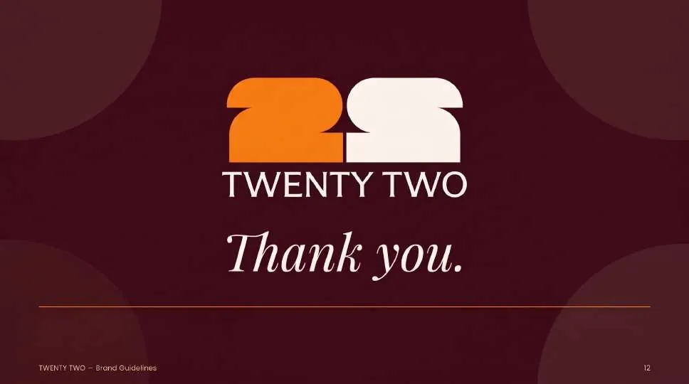
A 12-page guideline book: story, logo system, clear space, colour, typography, backgrounds, misuse and applications.
A range that reads as one brand.
Bags, fry cartons, burger box, bucket, cups and dip lids, alternating orange and maroon so every piece is recognisable on its own.
Ready to make your brand unforgettable?
Tell us where your brand is today and where you want it to go. We'll reply with a scoped proposal.
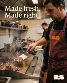
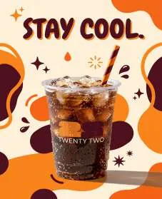
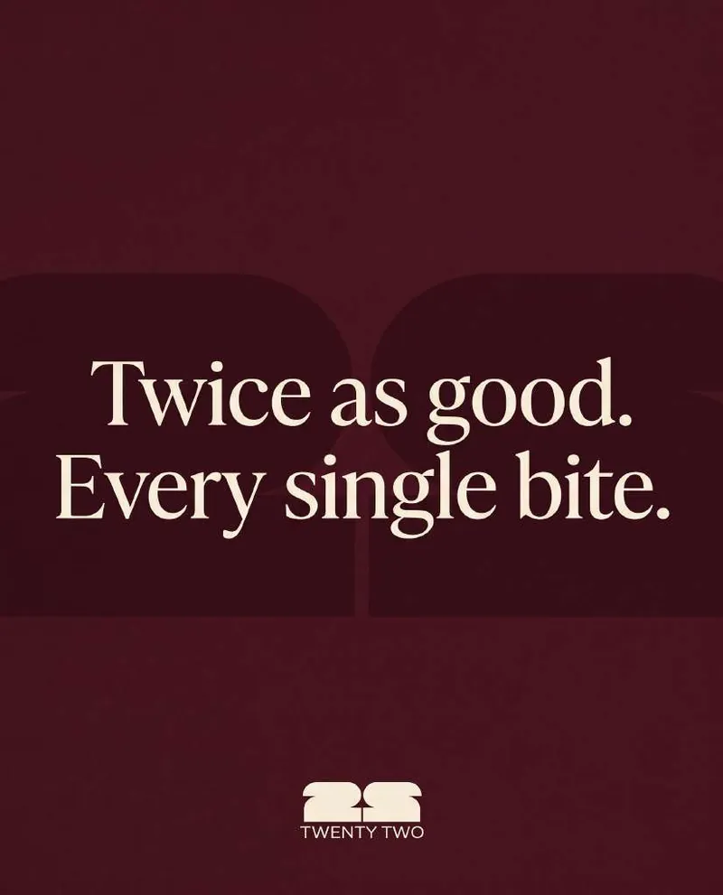
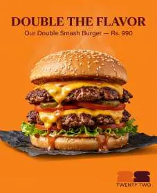
Launch content with appetite.
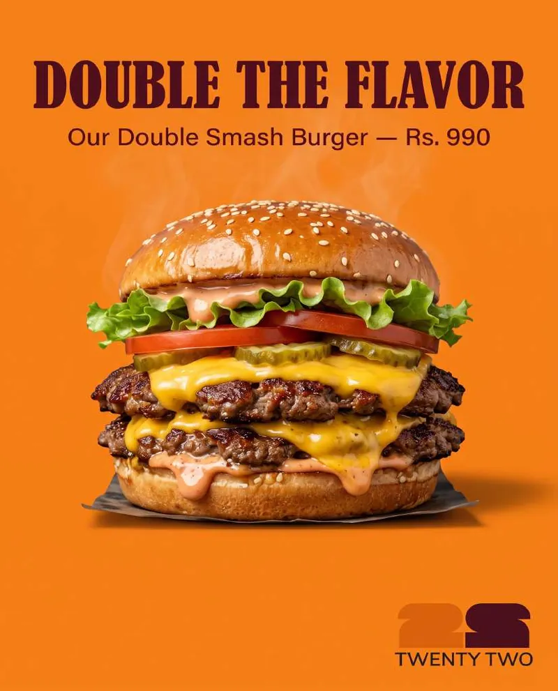
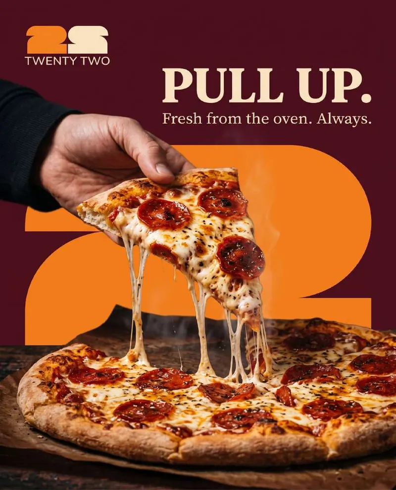
A teaser-to-launch feed: bold serif headlines, product close-ups and the monogram as a graphic device.