Tomgai Chinese
A warm, modern identity for a Chinese & Thai kitchen. A bamboo-stroke wordmark, a cheerful chef mascot and a red-and-cream system that runs from chopstick sleeves to billboards.
- Client
- Tomgai Chinese
- Sector
- Restaurant
- Scope
- Identity, content, packaging
- Deliverables
- Guidelines, mascot, 9+ applications
The idea.
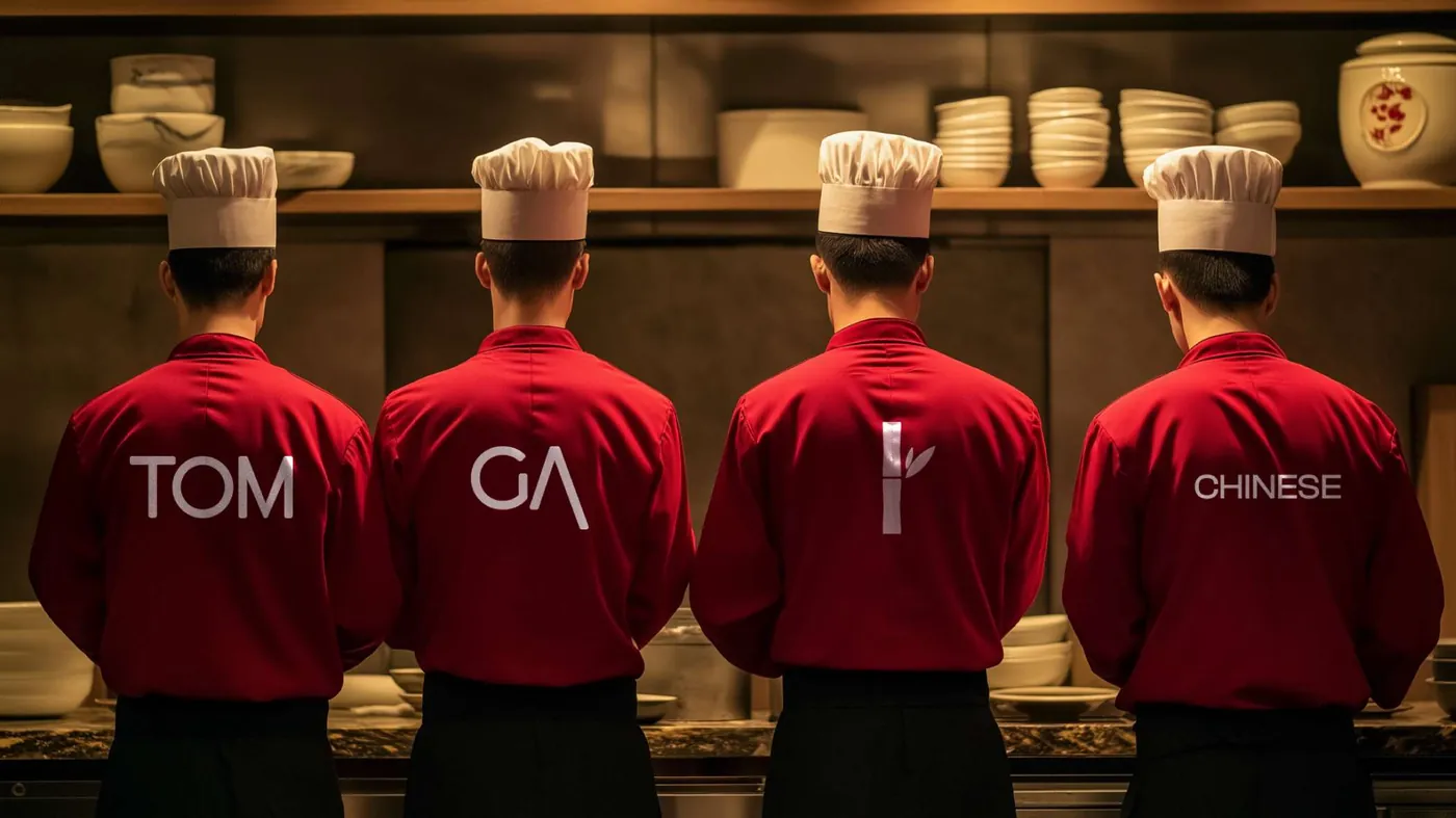
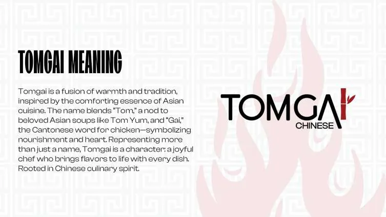
Tomgai is a fusion of warmth and tradition, inspired by the comforting essence of Asian cuisine. The name blends “Tom”, a nod to beloved soups like Tom Yum, with “Gai”, the Cantonese word for chicken: nourishment and heart in one word.
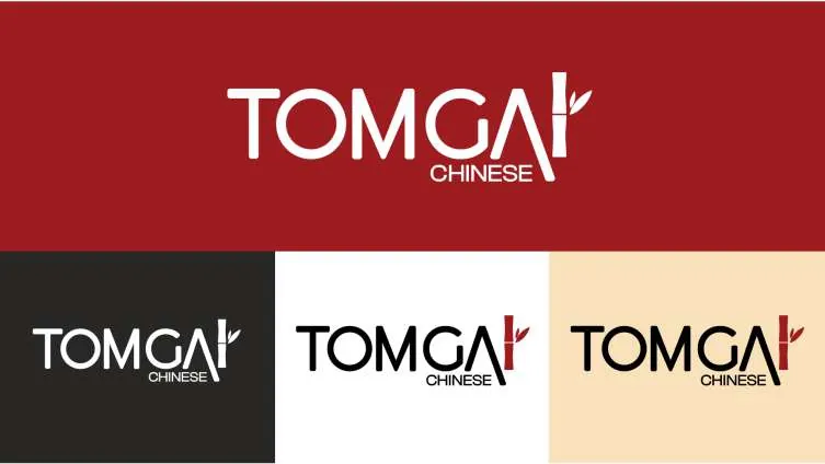
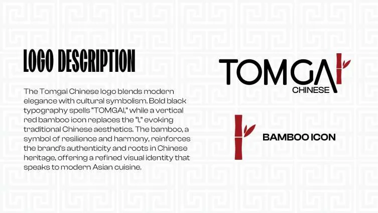
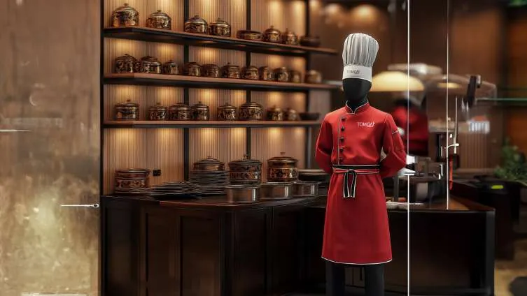
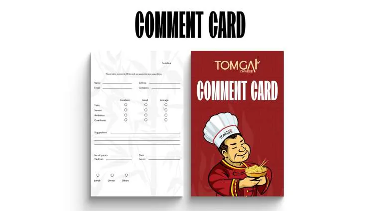
Bold black typography spells the name, while a vertical red bamboo stroke replaces the “I”. It's a symbol of resilience and harmony that gives the mark its Chinese roots without leaning on cliché. The mascot is a cheerful chef holding a steaming bowl, dressed in traditional red with a branded hat.

- 158posts
- 14.2Kfollowers
- 182following
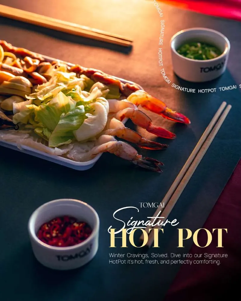 Menu
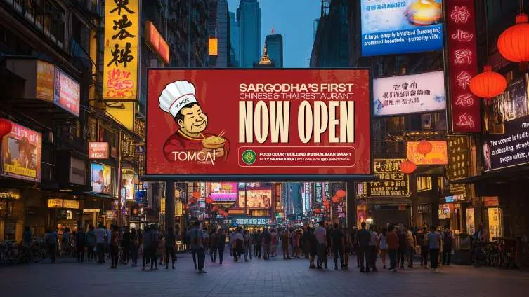 Launch
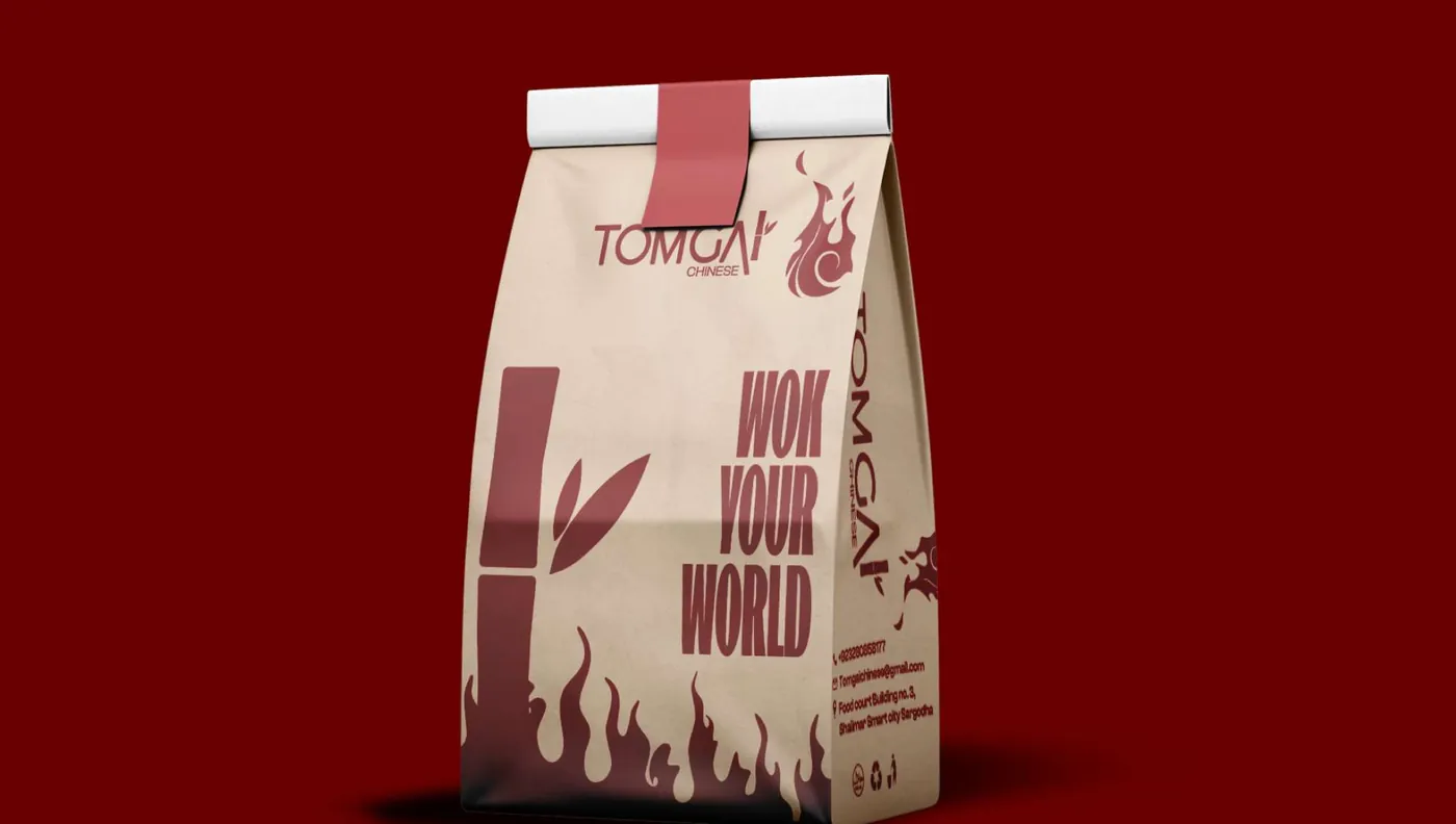 Takeaway
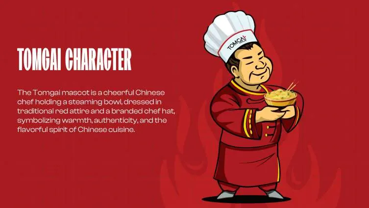 Chef
- Kitchen

A guideline book that covers every touchpoint.
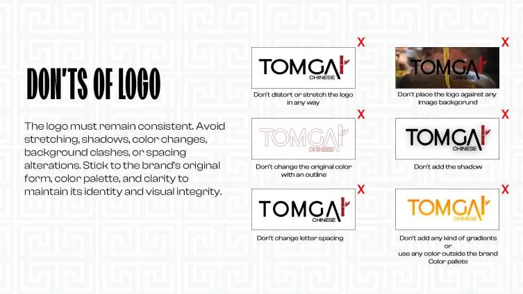
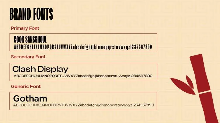
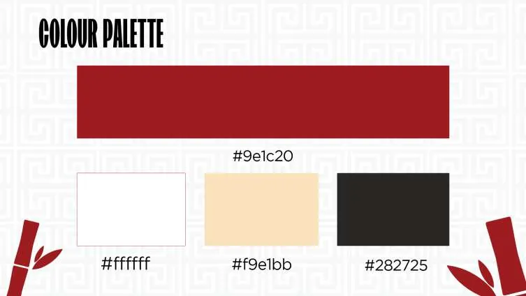
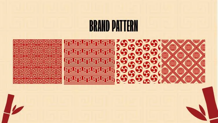
Logo construction, meaning, usage rules, colour, type, pattern and character, documented so every supplier gets it right.

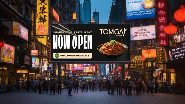
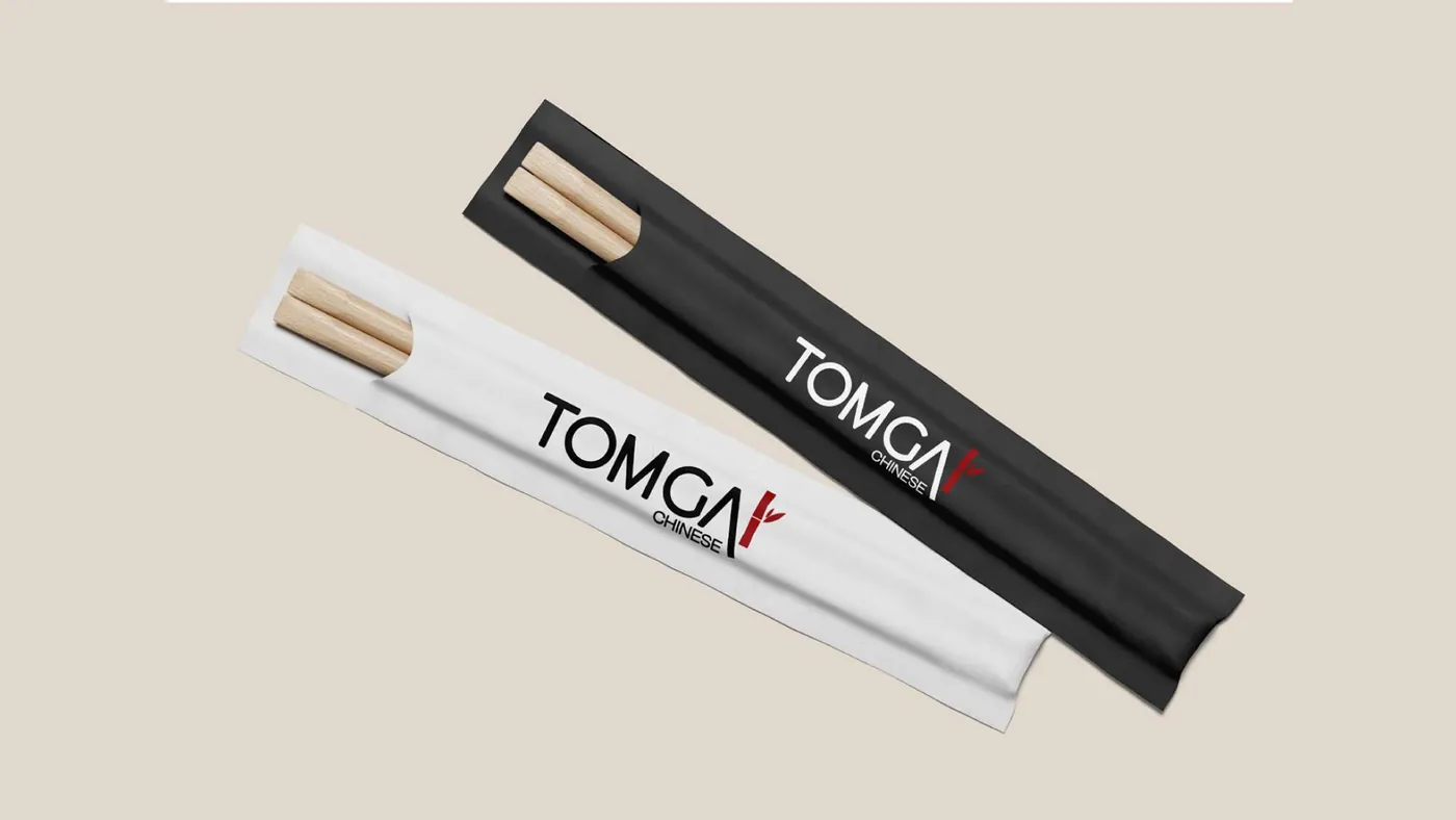
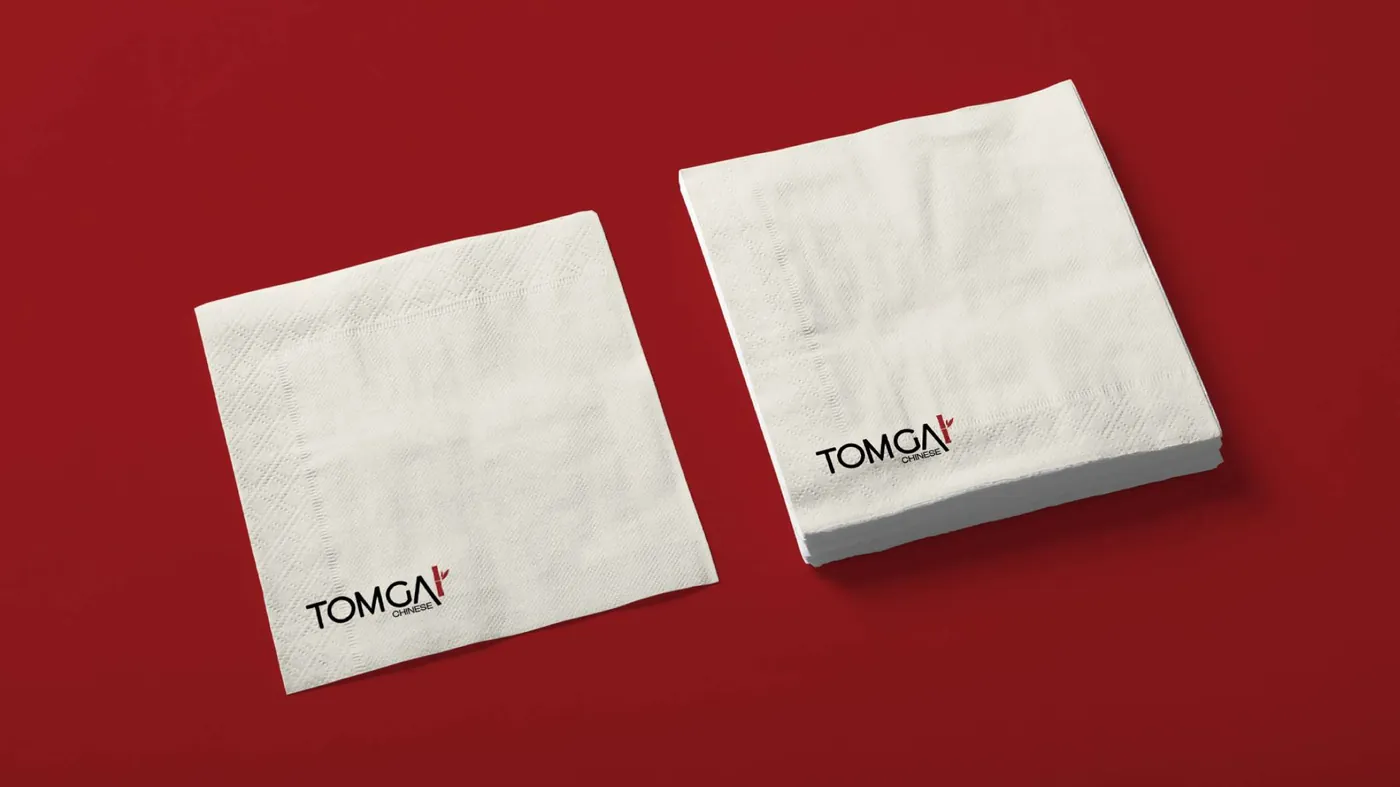
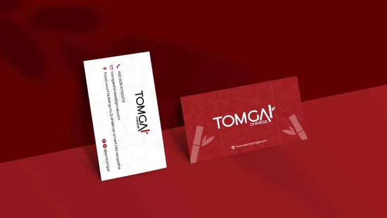
From billboard to chopstick sleeve.
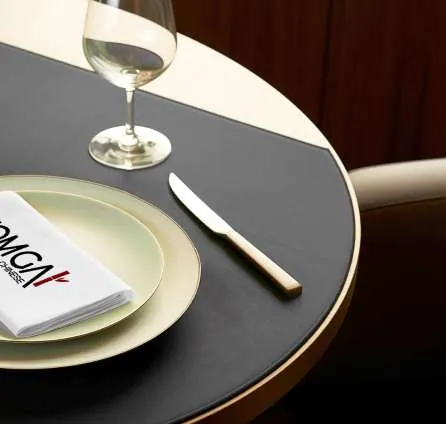
The system applied across launch media, packaging, uniforms and table service.

Ready to make your brand unforgettable?
Tell us where your brand is today and where you want it to go. We'll reply with a scoped proposal.
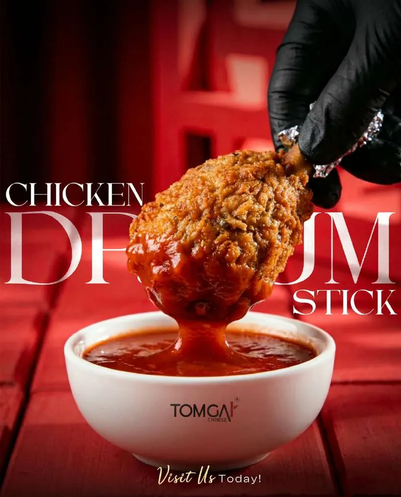
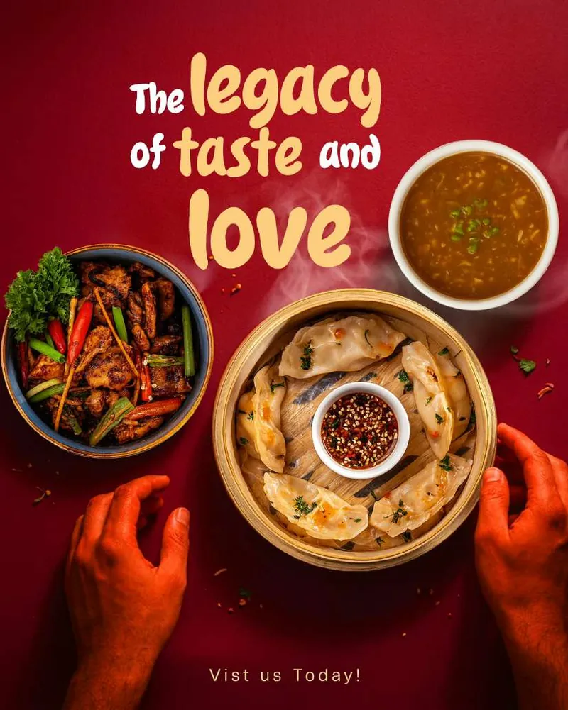
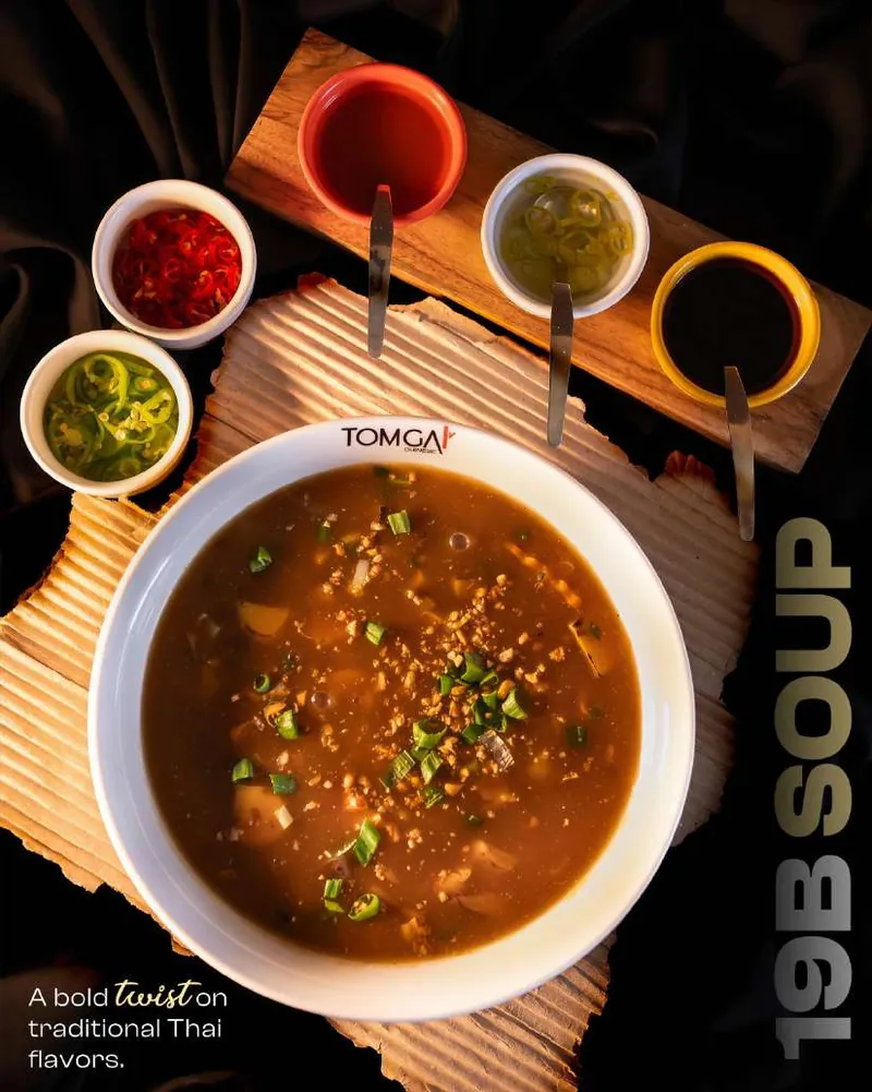
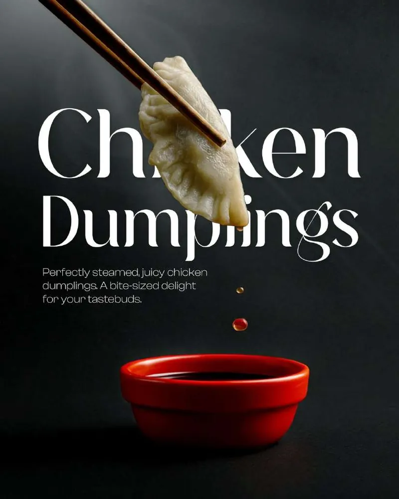
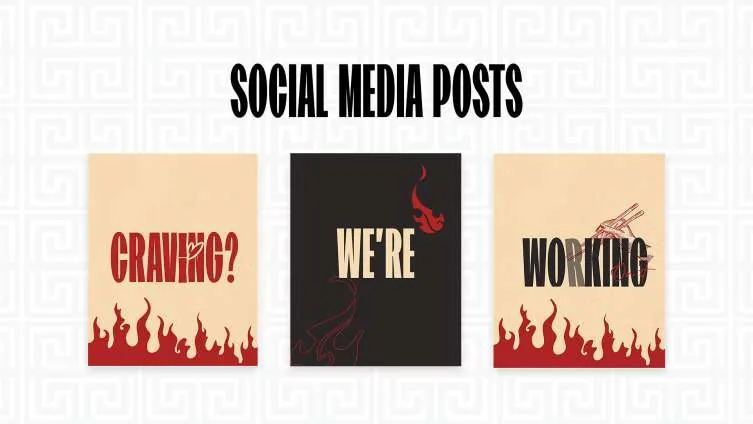
A feed that tastes like the menu.
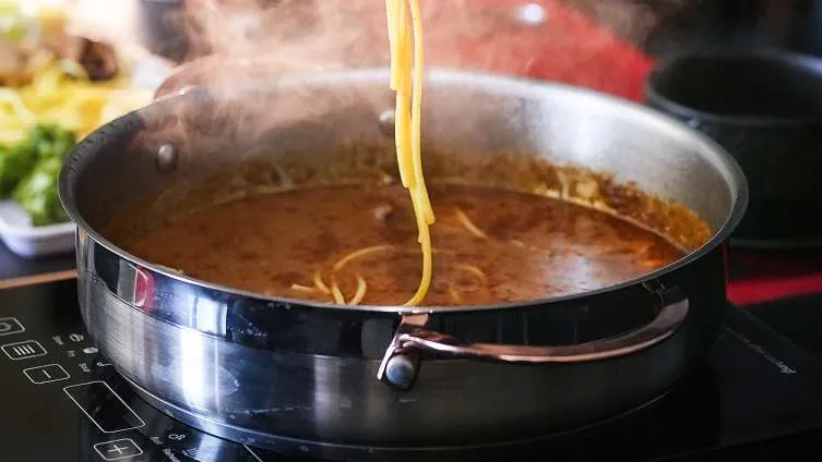
Dark, cinematic food photography with editorial type, built to stop the scroll and make the menu the hero.